Templates for
Mr
Porter
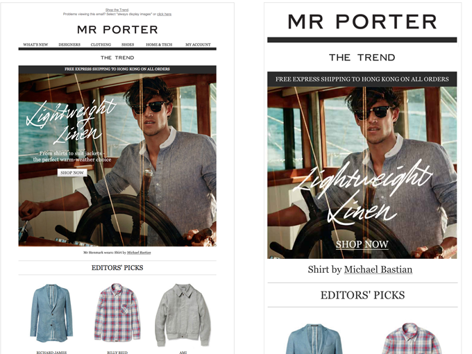
Adaptive emails for Mr Porter utilising some approaches highlighted in previous posts …

Adaptive emails for Mr Porter utilising some approaches highlighted in previous posts …

Weekly Trend Email desktop and mobile prototype screen shots
Working for Mr Porter recently on their Trend and What's New templates I was able to put into practice some of the compression techniques for high res assets discussed in previous posts. Below is a sample of one of the compressed @2x images vs a standard version that has been saved for web. In terms of download weight the results are surprisingly on a par.

The standard mobile hero jpg image. 33.5kb

The @2x retina hero jpg image. 33kb
With the remit to work as tightly as possible to existing designs concepts - a few refinements were proposed that would help the reduce download weight of mobile targeted content and overall emails.
Luckily Georgia is a font already used by the brand so making use of html text for various sections of the desktop and adaptive elements wasn't going to compromise the original design. Using system fonts where feasible makes it a lot easier to keep the text sharp and readable on high res screens without the need to resort to high res gif.

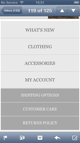
The little app style nav was also designed as a touch friendly mobile enhancement that doesn't require additional images or a lot of extra scrolling.