Device Targeted Email Content (ii)
An improved approach to the previously posted client-side slight of hand that enables mobile-only content …

An improved approach to the previously posted client-side slight of hand that enables mobile-only content …
Hidden reference to 80's new wave band - tick. Hidden content in email...
It seems the world has been cottoning on to the usefulness of device (or more precisely mail app) targeted content in email. The approach I first used back in 2012 gets the job done but feels a bit dated now (like the sound of Altered Images).
Still lots of caveats but worth highlighting a similar approach posted on Campaign Monitor's blogs which improves on the method I'd previously described. It probably degrades a bit less gracefully in older versions of Lotus but overall yields better results in Outlook and Gmail and is all round a bit less clunky.
@media all and (max-device-width: 480px) {
    *[class*="mobile-only"] {
    display: block !important;
    max-height: none !important;
    }
}
<div class="mobile-only" style="font-size: 0; max-height: 0; overflow: hidden; display: none;">
<!--  Image or Text Content Here -->
</div>
One thing I like about the technique is the way it can be used not just to present alternative content but also to play with the structure of existing resource for an alternate mobile layout. This gives a bit of scope to alter the hierarchy of the email without generating extra content.
Background images have long been recommended as a means to serve an improved experience for a header or other elements of a layout on mobile. But background images have been revealed to have their own draw backs and creating an alternative link for a bg image has also been a stumbling block.
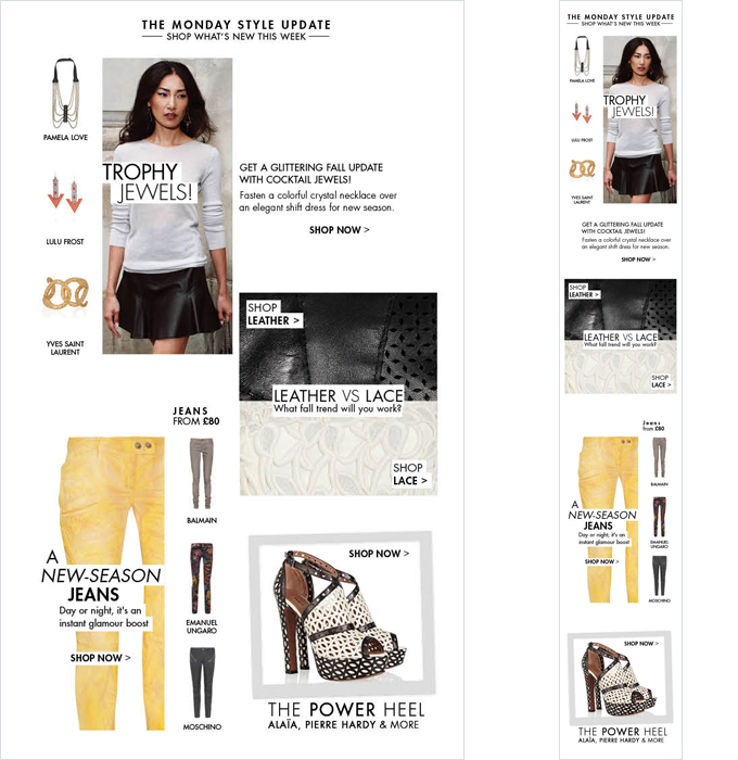
When generating template wireframes I've used the technique to try and allow for slightly more free form, less predictable layouts.

Part of an adaptive email for The Outnet. With one extra instance of an image tag hidden from desktop view + media queries support we can create the single column mobile layout
Granted it's not exactly in the ethics of best web practice to be repeating instances of the same content in this way. Not to eschew an ethos of respecting web standards but it can also pay to be pragmatic in a domain were they are not well adhered to. I think one has to be lead by the impetus for engagement when validating an approach. The take away being - an email should be like Kurt Russell - it doesn't always play by the rules but it goddamn gets results.
The duplicate image tag has its uses, all be it probably quite niche. I've found it useful for campaigns were the requirement of 'look and feel' takes priority. Sometimes that poses specific challenges so anything that can be exploited within those parameters to allow for more freedom or variation in the design or improve the experience beyond desktop is valuable.
The approach requires additional html but means not always needing to generate additional mobile resource or download extra image content to generate an improved mobile layout for media query friendly email clients.